How to Create and Effectively Use Edges in a Painting

Today we will discuss edges, how they are created, and how you can use them to attract the eye of the viewer.

First let’s define what an edge actually is. An edge is essentially a border between two contrasting elements.

The variations in the following components can create an edge: Color, Atmosphere, Light, Form, Shape, Texture, and Values.

You can remember this with the humerus mnemonic CALFS TV. Just imagine baby calfs on TV. (Yes calfs is a variant of calves. )

Edges fall on a continuum with one extreme being lost edges (aka soft edges) and the other extreme being found edges (aka hard edges).

Let’s look at an example of hard and soft edges created with color. The edge between blue and yellow will be much harder than an edge between blue and purple. See the example below.

Example of hard and soft edges using blue and purple and yellow and blue
Example of hard and soft edges using color alone

Now let’s look at an example of edges created with light. Shadows tend to have harder edges closer to an object and softer edges farther from an object. We can see this in the oil painting below of a red apple.

Oil painting of red apple and purple shadow with hard and soft edges
Shadow edges soften as they get farther from an object

Now that we know what edges are and have seen a few examples of creating them, let’s discuss how they can engage your viewers.

Hard edges naturally attract the human eye. Thus, sometimes it is helpful to use sharper edges in your focal point and softer edges as you move away from the focal point.

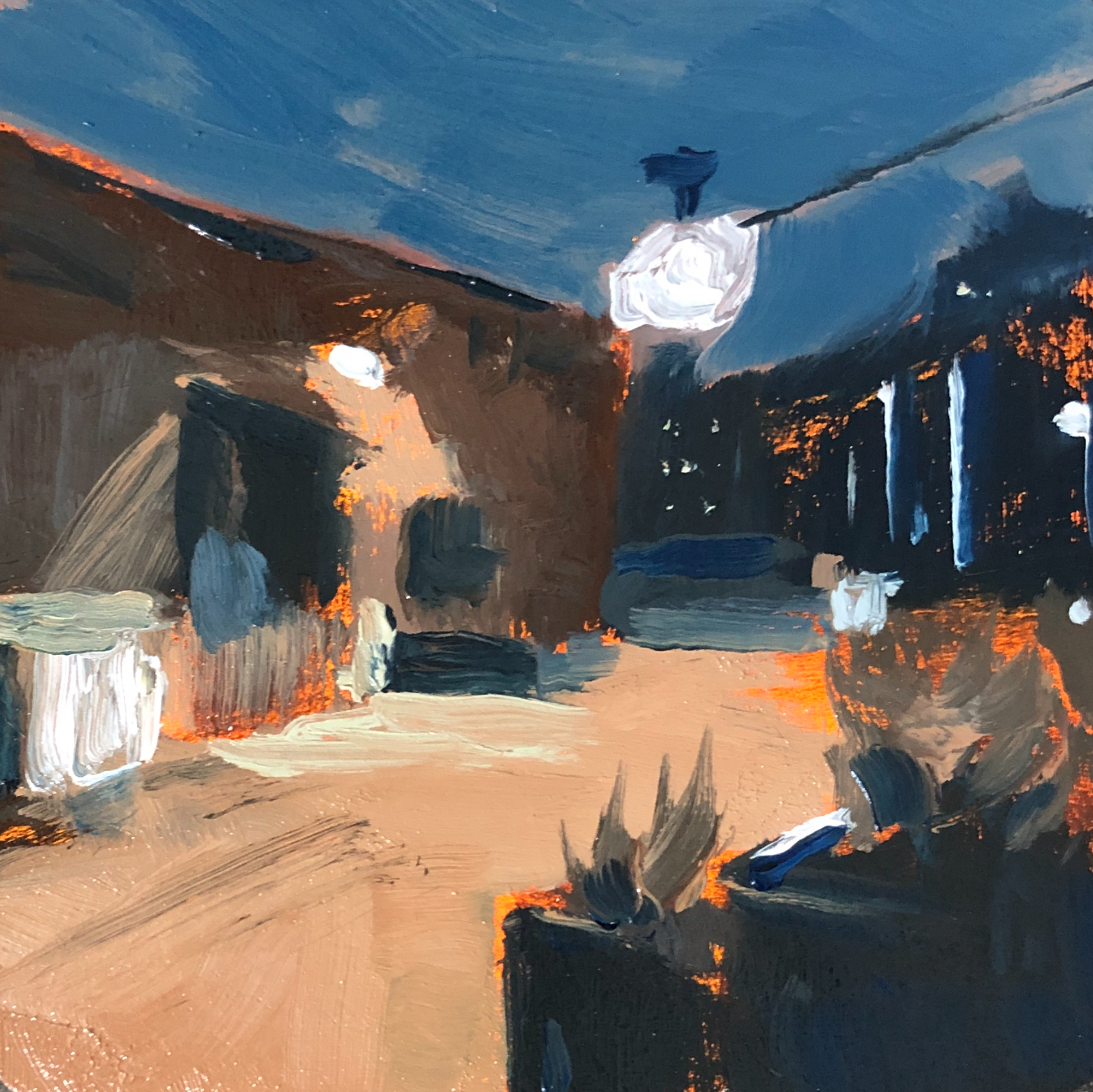
In the example below, I used harder edges in the fire hydrant to make it the center of interest. The edges in the background trees are far softer.

Red and yellow fire hydrant and green trees digital oil painting in procreate
Example of lost and found edges

Let’s summarize. Edges are created with contrasting borders and can be hard, soft, and anywhere in between. Hard edges can be used to make your focal point stand out among a sea of softer edges, attracting the eye of the viewer.

Do you use hard edges in your center of interest? Feel free to comment or ask a question. I’m here to be your painting guide.

Stop back tomorrow (and every day) for more tips.

Stay inspired

Bry

Monochrome Oil Paintings: Helping You Learn to Oil Paint Faster

Today we will discuss Monochrome oil painting and how it can help you learn to oil paint faster.

Monochrome paintings have a long history. They’ve been used for the foundation of transparent glazing and for underpaintings of opaque oil paintings.

But they can also stand alone as finished works of art.

Most monochrome paintings are created with just one pigment plus white. But you can also use a reductive approach and leave out the white.

For the reductive approach you will need to use an oil primer or non absorbent acrylic primer, like that from Michael Harding. Gesso is too absorbent to wipe back to the original white.

Now let’s discuss how monochrome painting can accelerate your oil painting skills, because that’s why you’re probably here.

First, monochrome paintings can help your opaque color paintings be more successful. By working out the composition, drawing, and values in one pigment, it enables you to paint with more confidence when you add color.

Second, monochrome painting can help you master brushwork and manipulating paint because you don’t have to worry about mixing color. This can help you get the feel for how oil paint handles much more quickly.

In fact, most traditional painting schools have students start with graphite and charcoal first and when they finally graduate to using paint, it is usually monochrome painting.

By focusing on just one pigment, you can master values and putting paint exactly where you want it, without having to struggle with color mixing as well.

As an added bonus, it can save you tons of money. Many people cite expense as a barrier to learning oil painting. By using one pigment, say, burnt umber, you can learn oil painting for a fraction of what a full palette would cost.

You can get a 37ml tube of M Graham burnt umber for under $10.

Stay tuned for the next article on painting on a budget.

What pigment do you like for monochrome paintings?

Let me know in the comments. I’d love to hear from you and help you on your painting journey.

Stop back tomorrow, and everyday, for more tips.

Stay inspired,

Bry

How to Start an Oil Painting: Exploration, Block in, or Drawing?

Today we will discuss three different ways to start a painting—exploration, value block in, and a detailed line drawing.

All are acceptable. We have to find what works best for us and our subject matter. First let’s look at the method of exploration.

One benefit of exploration is you get to discover interesting paint applications along the way. This is great if you have trouble fully envisioning what you want your completed painting to look like.

Often, painters will simply indicate where major landmarks will be. In a portrait, for example, you might simply mark the location of the eyes, nose, and mouth, and then let the painting evolve from there. One downside is that it can involve lots of scraping off, layering, and trial and error.

Another option is to complete a detailed line drawing first. This can be completed free hand via sight size or other measuring method or by some means of transfer, such as a projector if you are enlarging a smaller drawing.

This process can be helpful if you are not comfortable drawing with paint. It lets you work out all the drawing details in graphite or charcoal. It can be easier to make corrections if you are more comfortable with dry media.

One downside is that once you start painting you lose your drawing. So if you make any mistakes you have to scrape off your paint or make adjustments wet into wet. It can also make a painting appear a little stiff with less confident brushwork if you are trying to remain in the lines. It also doesn’t provide good value information.

Finally we have the value block in. In this method you essentially complete most of the painting in monochrome. Like a graphite drawing, it lets you work out any issues in drawing and composition before putting on thick paint. The thin paint makes it easier to make corrections.

Unlike a line drawing, this method also provides you with value information. This can help when mixing colors, and it can minimize scraping off and trial and error.

This method works well if you are comfortable drawing with paint, but to do so, it’s helpful to have an oil ground or non absorbent acrylic primer, like the one offered by Michael Harding.

Traditional gesso is too absorbent for this technique and thus you can’t fully erase your mistakes. Oil primers enable you to wipe off paint to correct mistakes and create reductive highlights. I like the oil ground from Gamblin.

While there are certainly plenty of other ways to start a painting, these are a few of the most common, and all work rather well. The choice is yours to determine which suits your style of painting.

Do you draw with graphite or with paint? Let me know in the comments. I’d love to hear from you and help you on your painting journey.

Stop back tomorrow, and everyday, for more painting tips.

Stay inspired,

Bry

How to Oil Paint Thick Over Thin Without Solvents or Turpentine

Today we will discuss how to oil paint thick over thin without solvents.

One of the main reasons I hear people say they don’t oil paint is because of solvent and medium toxicity. Is this a barrier for you?

But what if I told you that you could oil paint without ever using solvents. It is possible: Rembrandt painted this way. And so can you. I’ll teach you the secrets. So let’s start with toning grounds.

Instead of solvent, use just a drop of walnut oil (I like M Graham) to make the paint glide easier over your painting ground. Using small amounts of oil will ensure you have strong paint layers. Using solvent thins the paint too much and can make paint layers brittle.

Next, wipe off all the excess paint and oil. The result is a lightly stained ground. A ground is just your first paint layer, usually gesso or oil primer. So then how does one paint without mediums after that? The secret is in the paint.

Some oil paint is made with extra fillers that can make it very stiff. This makes it hard to mix and apply unless you lay it on extra thick. The key is to use paint with just oil and pigment as the ingredients. This will let you paint in thin layers without having to thin it with a medium.

Two examples I like are Michael Harding and M Graham. Their paint is very soft and easy to mix and apply. It will enable you to paint in thin layers and slowly increase the thickness. But aren’t they way more expensive?

Yes, it is more expensive. But if you consider that it is only a few more dollars per tube than, say, Gamblin, it doesn’t amount to much more because you are saving money by not using mediums while you paint. Still too expensive? Here’s a tip.

Try sticking to series 1 paints and earth colors. You can make an amazing landscape or portrait painting with yellow ochre, Prussian blue, and Venetian red. They are quality paints and dirt cheap compared to cadmium colors. Pun intended. 🙂

Cadmium colors are nice for their opacity and high chroma but not always necessary and very expensive. And you have to be extra careful with them around kids and pets.

So let’s recap what we learned. You can easily tone painting grounds with a little walnut oil instead of solvent. And to paint thinly without mediums, consider investing in premium paint that only uses oil and pigment as ingredients.

Oil painting doesn’t have to be complicated or toxic. With just a few simple materials you too can enjoy the buttery feel of oil paint on your brush.

Do you paint solvent free? Comment below. Or ask me a question. I’d love to help you on your painting journey.

Stop back tomorrow, and everyday, for more painting tips.

Stay inspired,

Bry

How to Simplify an Oil Painting and Get Better Results

Do you ever feel overwhelmed when you start a painting? For today’s tip we will discuss how to make a painting less complex so you can be more successful.

When starting a painting, you have to get the drawing accurate, then mix the right color and value, then apply the right brushwork. It’s a lot. So why not just focus on a few principles instead? Some of the most famous painters did just that. (More on that later.)

It’s very hard to get every element right in a painting. So try to pick just one or two areas if you feel overwhelmed.

For example, you can make a monochrome painting that mostly focuses on drawing and values. Plenty of master painters make these types of paintings. It will help you learn drawing with paint without getting too bogged down in colors.

Once you get comfortable with that, then maybe try a painting with a limited palette. You’ll still have to mix colors, but you can focus more on values. The limited palette will keep you from trying to match every color in the rainbow.

Plenty of masters painted this way. Zorn often used a palette of just cad red, yellow ochre, and ivory black. That’s it. His colors probably weren’t fully accurate to those seen in life, but he mastered the values in his portraits.

Maybe you’re not big on drawing or photo realism. Then maybe color should be your focus. Don’t stress over mastering the drawing. Work on color schemes and tricks like optical mixing. Monet was a master of this. There are few crisp lines in his work. Often his goal was experimenting with color, not necessarily drawing.

This isn’t to say never work on drawing or banish all colors, especially if you want to improve. Just don’t overwhelm yourself.

Don’t try to master your symphony all in one take. Work on the various components and then work on blending them together.

What topics would you like to hear discussed here? I’d love to hear from you and help you on your painting journey.

Stop back tomorrow, and everyday, for more painting tips.

Cheers! —Bry